Cigna Healthcare
The redesign transformed the insurance eSales journey across VHIS, Elite, and Plus products from a high drop-off e-sales into a seamless self-service insurance journey. We turned the lengthy underwriting questionnaire into a friction-free online application, introducing first-step lead capture.
Timeline
Oct 2025 - Dec 2025
Role
UX Designer
Scope
User Research, Wireframing, Usability Test Prototyping
CHALLENGE
SOLUTION
Radical transparency:
side-by-side product comparison
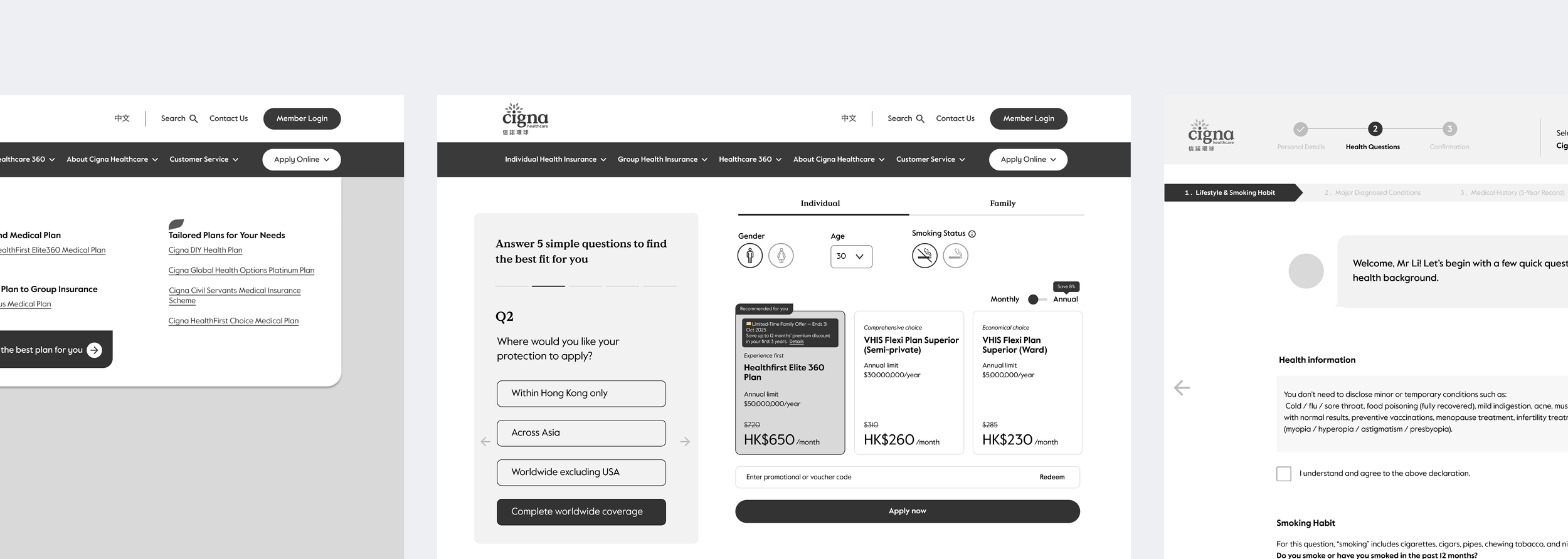
Users need to understand exactly what each plan includes and how the options differ. A clean, scannable comparison table becomes the product’s primary trust-builder. With a clear visual hierarchy, side-by-side layout, and trust-building badges like “Highest Coverage,” inclusions and key differentiators become understandable at a glance.


Guided personalised discovery:
Find the best plan
A five-step recommendation questionnaire that steps in for the advisory role of a human agent. Through contextual guided questions about current coverage, lifestyle, and major life changes, it breaks a complex decision into a conversational flow—supported by visual progress bars and free of insurance jargon. This feature turns a daunting decision into a step-by-step smart product finder.
Give-to-get quote: Upfront pricing with minimal friction
Data revealed a 64% drop-off between “Select a Plan” and “Personal Details.” To close that gap, we embedded a “Get a Quote” mini-form directly on the plan page—users enter only sex, age, and smoking status to see an indicative premium. Capture user data and generate qualified leads, enabling us to retarget the right customers with the most relevant and impactful messaging.
Virtual guidance: Clear progress indicators and encouraging microcopy
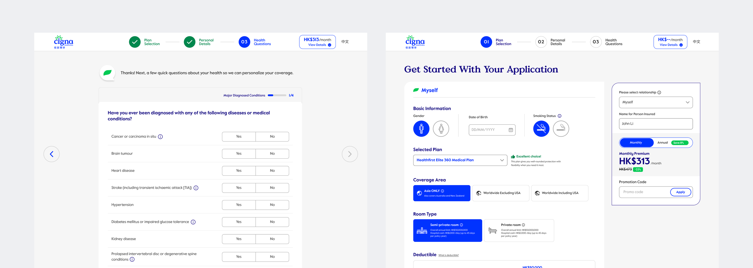
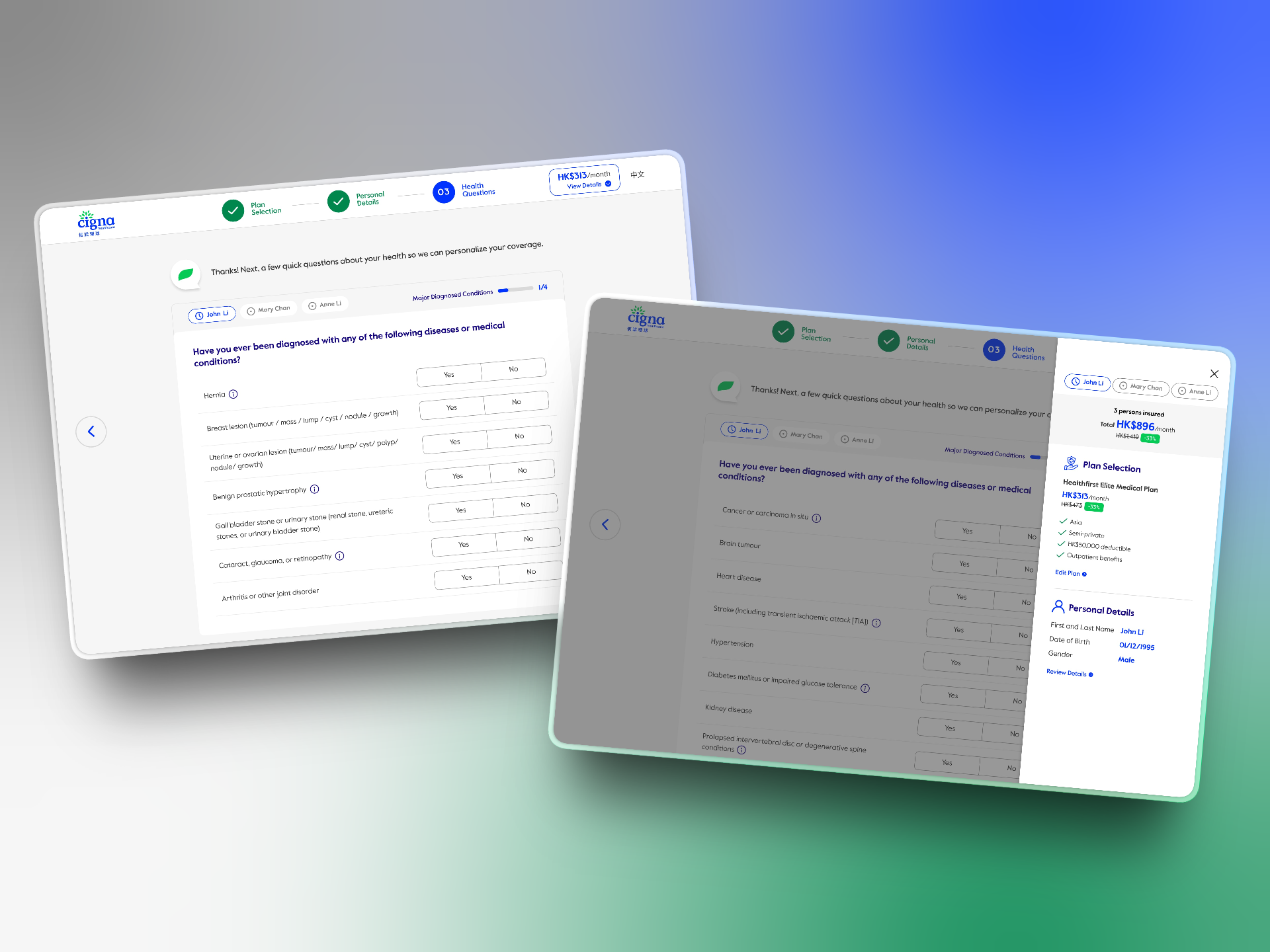
Long, multi-step forms causes uncertainty and frustration leading to abandonment. A top-level macro-progress stepper surfaces the three main phases—Plan Selection, Personal Details, Health Questions—setting clear expectations for the application flow. Conversational, supportive microcopy then guides users through each step, acting as an invisible hand that visually anchors them in the process and reduces mid-funnel drop-off.
96% of users who began the underwriting process abandoned Cigna’s direct-to-consumer e-sales journey. For every 1,000 visitors, only 5 completed a purchase. How do we redesign this agent-less journey to make a lengthy, high-consideration purchase feel simple, trustworthy, and achievable online?
The Blueprint for a Frictionless Funnel
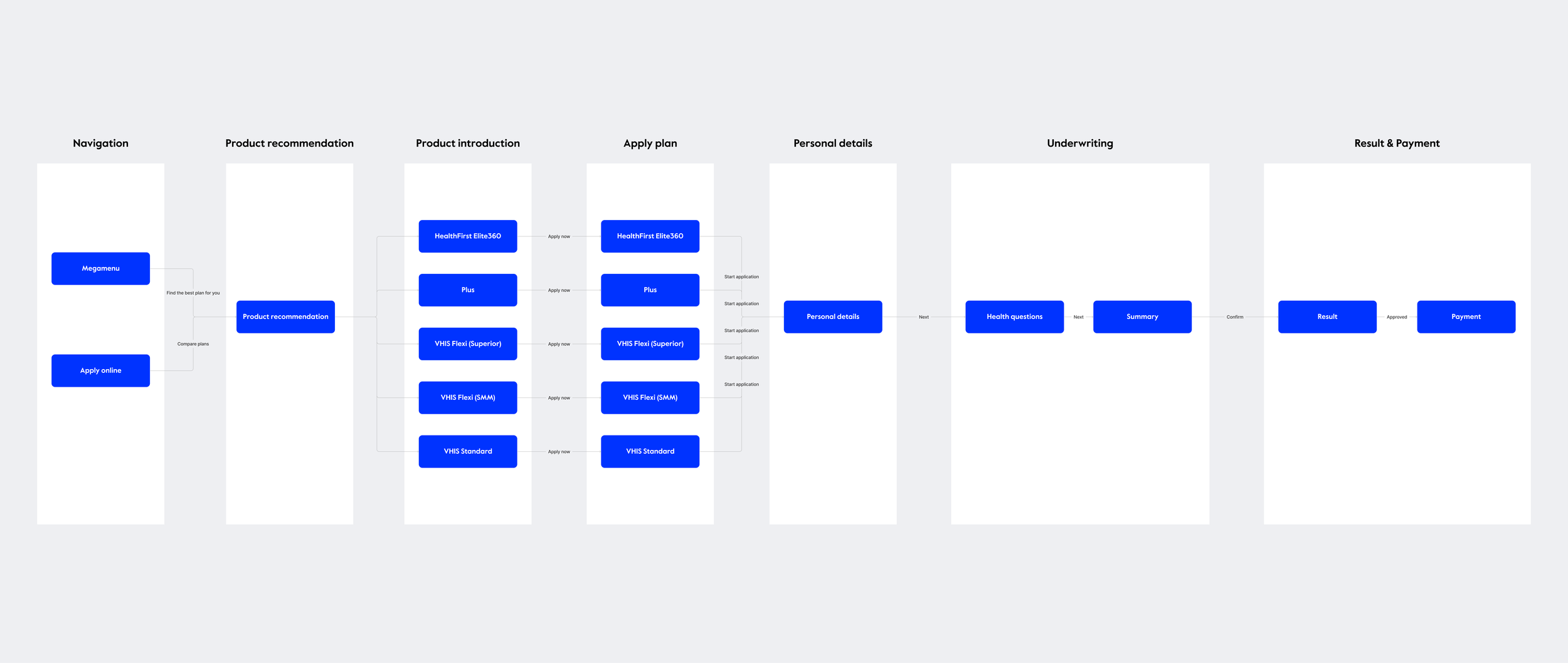
Mapping the user flow diagram became the foundational architecture for our wireframes. We mapped the end-to-end e-sales journey to identify exactly where users drop off, where they need reassurance, and where we could introduce flexibility. The flow spans 7 phases, from initial navigation to final payment, visually anchoring the complex insurance application process into a clear, manageable path.
Five core solutions demonstrate how strategic UX can bridge the gap between complex financial products and user confidence, systematically dismantling the friction points that cause massive drop-offs.

The safety net:
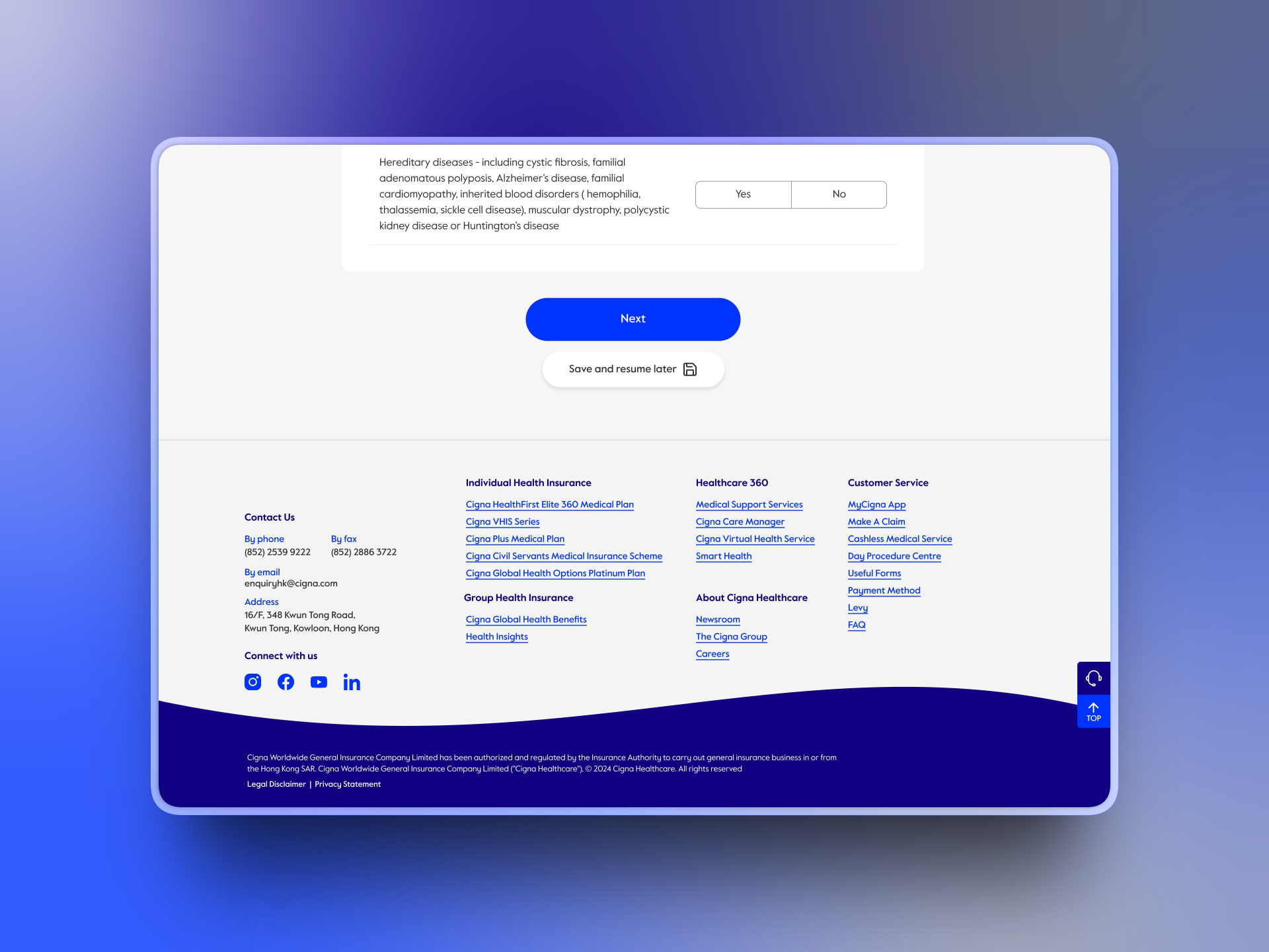
Save and resume during underwriting
The underwriting and medical history section is the most intimidating step in the e-sales journey, resulting in a 96% drop-off. Users often don’t have their medical details on hand and feel forced to complete everything in one sitting. A highly visible “Save and resume later” call-to-action acts as a digital safety net, reassuring users that their progress is saved. By introducing recovery mechanisms, we transformed a rigid funnel into a flexible, user-controlled journey.
LEARNINGS AND KEY TAKEAWAYS
Validation through usability testing
Moderating usability tests with specific tasks and our interactive wireframe prototype with six participants taught me that validation is a continuous loop. It not only reinforced our core design decisions, but also uncovered critical friction points. This experience sharpened my ability to translate qualitative user data—observing where users hesitated or struggled—into actionable design improvements, ensuring the final product was built on evidence rather than assumptions.
Navigating regulatory complexity & designing for compliance
From managing complex family applications and designing a deductible slider with $10K increments to navigating rigid compliance requirements—such as clicking through every medical question and lengthy T&Cs—I learned that simplification doesn't mean removing complexity; it means making it navigable. The real design challenge is structuring heavy regulatory requirements into a clear, digestible flow that protects the business without overwhelming the user.