Bank of China
(Hong Kong)
A full UI/UX revamp of the credit card discovery, comparison, and application journey within BOC's mobile banking app. The project transformed a fragmented, text-heavy experience into a guided, transparent, and confidence-building flow—validated through usability testing with six participants across key customer segments.
Timeline
Apr 2026 - May 2026
Role
UX Designer
Scope
Market Research, Wireframing, Usability Test Prototyping
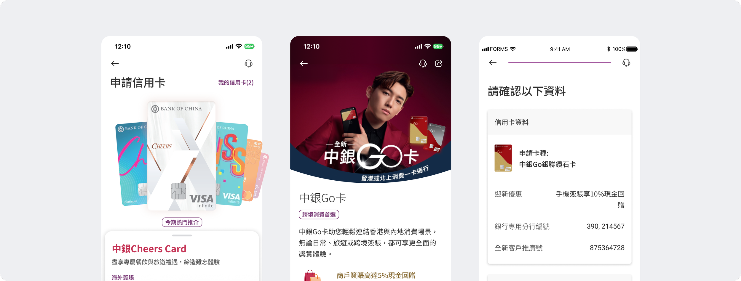
CHALLENGE
SOLUTION
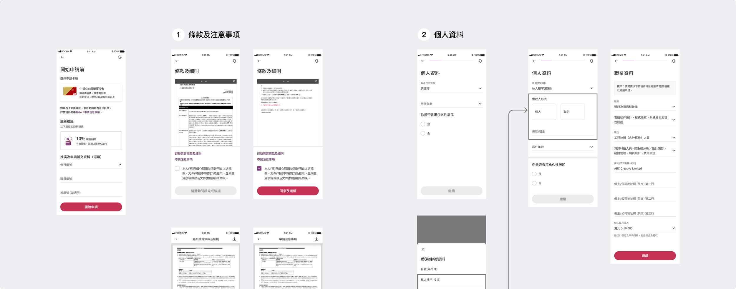
BOC’s existing flow had no clear entry point, buried card information in text-heavy detail pages, and failed to guide users through a complex multi-step application. For a bank competing with digital-first challengers like Mox and HSBC, the friction was costing conversions.
Rebuilding the funnel from discovery to approval
Competitor analysis and market research gave rise to opportunities in designing a seamless, confidence-building application flow by balancing simplicity, guidance, and data reuse. Mapping the end-to-end journey revealed structural breakpoints, giving rise to six core solutions that bridge the gap between complex banking products and user confidence.
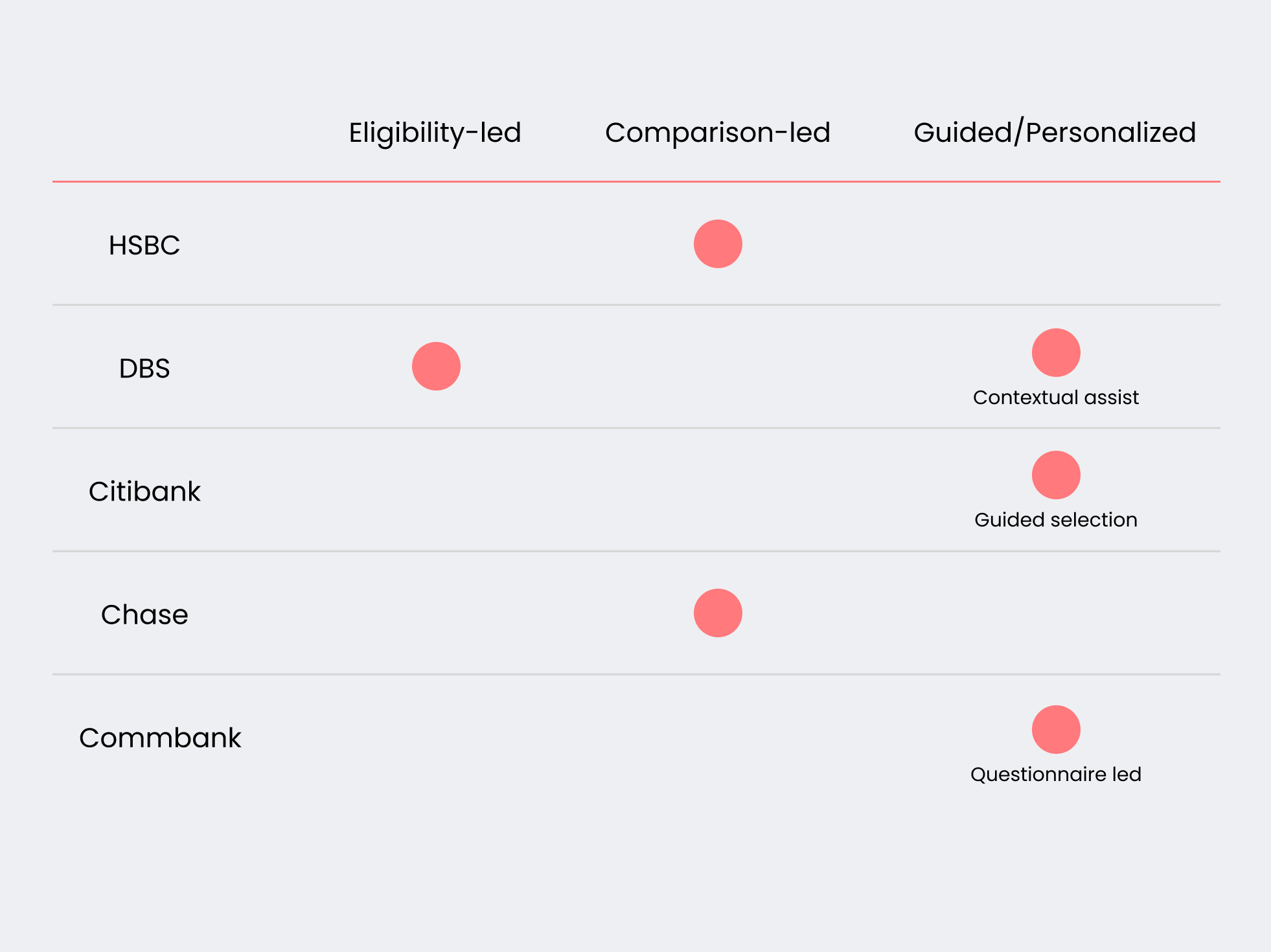
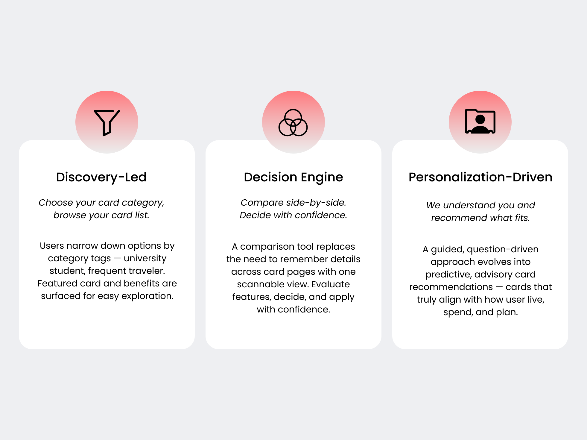
Card discovery patterns across competitors
No single approach dominates—banks optimise for different ways of helping users decide.
Our approach
3 distinct ways users find the right credit card to apply for emerged from market research—each shaping one of our design directions.
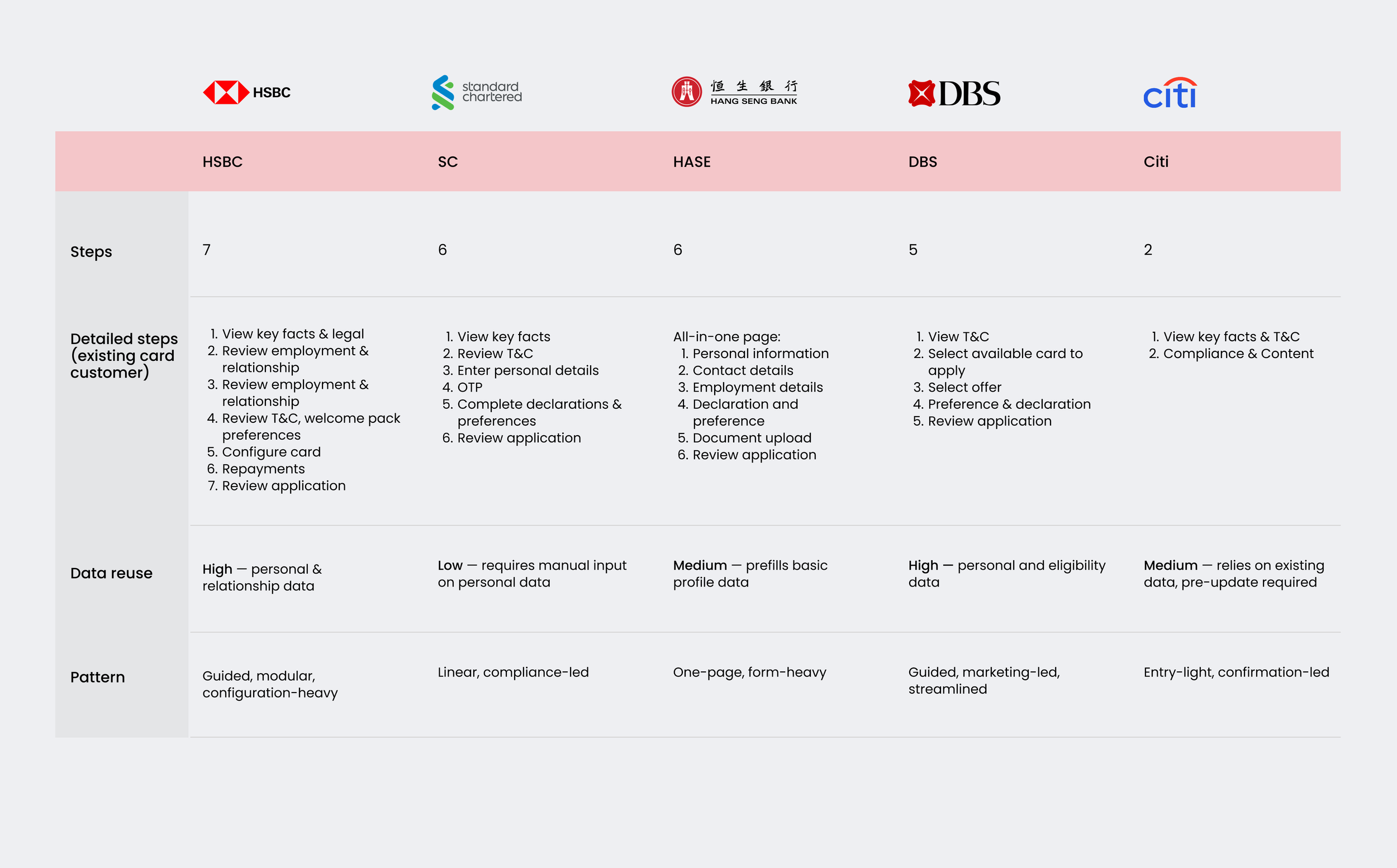
Market overview: steps, patterns & data reuse
Benchmarking market practices to identify opportunities to reduce friction and improve application completion.
Key Insights:
High data reuse enables faster completion (HSBC, DBS)
Form-based flows require more manual input, increasing user effort (SC, HASE)
Short submission flow with minimal steps, enabling quick completion, with profile updates required prior to application (Citi)